3. Design Inspiration
After spending a lot of time looking at luxury brand watches, newer minimal watches and scrolling through reddit/watches, I narrowed down the inspiration for my design to two watches / brands.
The first is a well known Italian luxury watch brand, Panerai. They have a nice origin story and what has become their signature design had several design elements that were born out of a functional need. Panerai’s website has a great write up on their history.
There are two design elements that really attracted me to Panerai and fit well with my design objectives for this project:
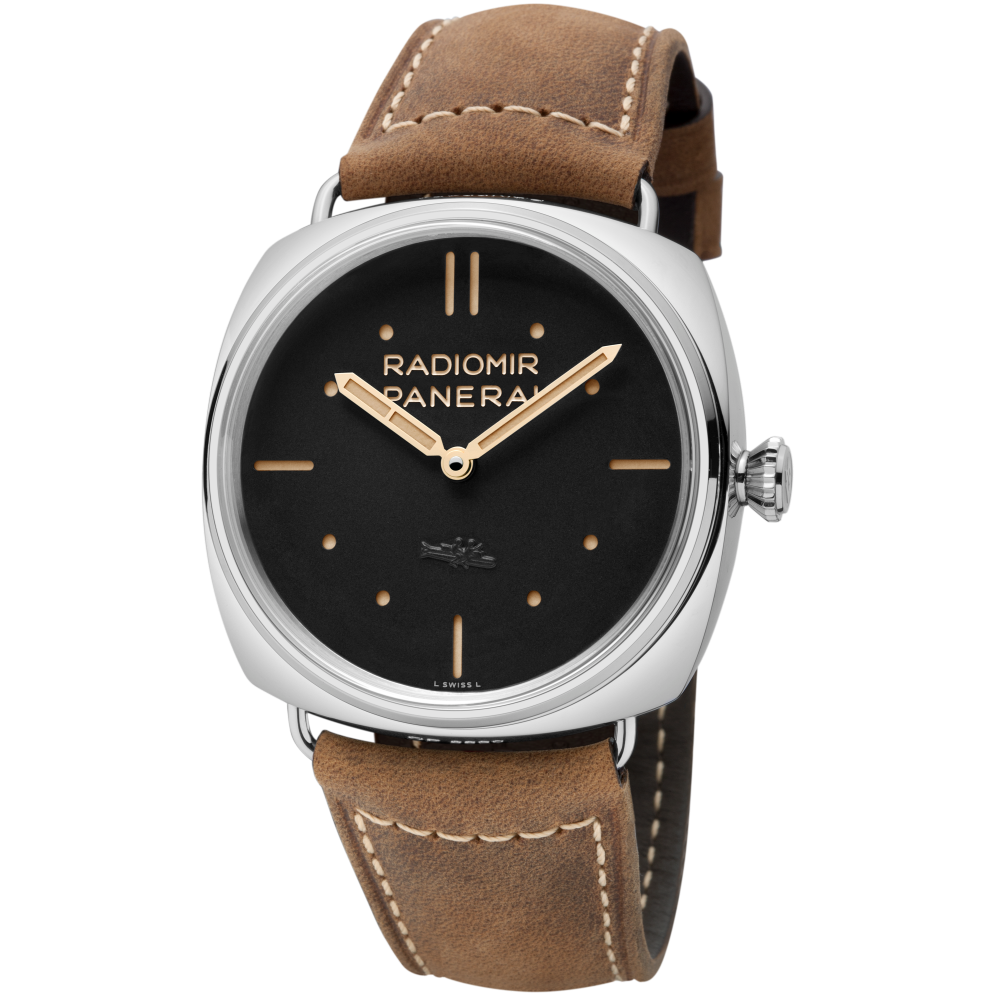
Case Design: Panerai has become recognizable because of its ‘cushion’ case design, which is an elegant departure from the typical round cases that are ubiquitous.
Dial: The dials on Panerais have 2 layers. The top layer that you see has cut-outs for the indices or numbers and the layer below has the paint for the indices. I like this because this approach allow for easier manufacturer of a dial where I do not have the luxury of pad printing. I also love the simplicity and elegance of the dial on the Radiomir S.L.C. that uses lines and circles instead of numbers for indices. They story behind it is pretty interesting too!
Radiomir S.L.C.
The second watch that piqued my interest is made by a newish European company, Baume. Their ‘Iconic’ edition watches have the best take on a ‘skeleton’ watch I have come across so far. They also use the Miyota 82D7 movement which allows for an interesting layout of the hands - you can have only a minute hand in the center and have the hour hand offset closer to 6 o’clock.
Baume ‘Iconic’
So, having narrowed down my inspiration that gives me direction for what can be done with the movement I want to use and a simple way to make an elegant dial, I plan to take design elements from both these watches for my own design.


